Tuesday, 11 December 2012

Experiencing the Living City

Sketch of Exhibition at the Institute of Contemporary Arts in London on 19th June-2nd August 1963


     Archigram believed that the city was the single distinct organism and the Living City Exhibition is a response to the city life. During this time, many argued that the submissive process of building cities has lost all its past spirits including Jane Jacob and William H. Whyte. It became a search for a way back to when city was full of life and enthusiasm. However, discussion surrounded the question of whether not only of their developing trends and changes, but more important of their existence. This concept is a focus on the man as a subject and as the one who sets up the condition and mood of the environment. Fearing the lost of cities would lead to the sprawl of the suburban because of its high standards of comfort, Archigram tries to create an experience in the exhibition. Although there are many bad qualities to the city such as “corruption of the young, overcrowding, exposure to risk”, but by creating a series of small rooms, where the people walking around will share an experience in the space, Archigram was showing the positives. Using only triangles is a sensible choice as a structural feature to separate the spaces, each division is its own theme including: “Man, Survival, Community, Communications, Movements, Place and Situation".The boundaries of spaces are not clear as it is similar to reality, they coincide with each other. As Peter Cook states: “‘Why have you not stated an answer to the problem, why have you not an image of the city of the future?’ We feel that it has been primarily necessary to define the problem. We have set the scene. We have attempted to capture that indefinable something: the Living City”. This was the beginning of the group’s extended reaction to the cities of the future.


The triangular units, which can be prefabricated, to form 'gloops' (different spaces) in plan.


Monday, 10 December 2012

Furniture Manufacturers Association Headquarters


    This was fourth year project that attracted Peter Cook and David Greene to Micheal Webb. Reyner Banham, architectural critic and prolific writer, called it "Bowel-ism" referring to Webb's influence of organic forms. 


Michael Webb. Furniture Manufacturers Association Headquarters, project, High Wycombe, England, Side elevation. 1957-58

Graphite and ink on tracing paper mounted on board showing precast concrete biomorphic structure by Mike Webb (1957-58)

Quotes by Archigram


Archigram office in 1972


“ The happenings within spaces in the city, the transient throw-away objects, the passing presence of cars and people are as important, possibly more important in determining our whole future attitude to the visualization and realization of city”
- Warren Chalk (Archigram member)

“We are in pursuits of an idea, a new vernacular, something to stand alongside the space capsules, computers and throw-away packages of an atomic/ electronic age”
- Warren Chalk (Archigram member)
“…somebody once said to me, ‘Don’t you want to see it built, don’t you want to be an architect?’ To my mind, the assumptions behind these questions betray a misunderstanding as to what the work of Archigram represents. A misreading of it as a set of proposals, a set of windows through which to see a ‘new world’, is only a rather pathetic regurgitation of the dogma which asserts that architectural drawings are representations of something that wishes to become."

-David Greene (Archigram member)


“ The rounded corners, the hip, gay, synthetic colors pop-culture props all combine to suggest an architecture of plastic, steel and aluminium, the juke boz and neon- lit street, the way a city environment should be”       
- Archigram

The diagonal, “ is not only a product of current engineering experimental preference, but implies a purpose of the structure that is new to buildings: To provide an umbrella whithin which growth and change can take place”
-Archigram

“The fundamental characteristics of futuristic architecture will be expendability and transience. Our house will last less time than we do, every generation must make its own city”
- Archigram

“ Almost without realizing it, we have absorbed into our lives the first generation of expendables… food bags  paper tissues, polythene wrappers, ballpens, e.p’s … We throw them away almost as soon as we acquire them. … Every level of society and with every level of commodity, the unchanging scene is being replaced by the increase in change of our user-habitats— and thereby, eventually, our user-habitats"
- Archigram

Legacy: Anna Rewakowicz


Conversation bubble


    Anna Rewakowicz is one of many modern artists influenced by Archigram. Her interest: "the 1960's avant-garde's desire to create alternative propositions for living". She deals with contemporary issues of materialism and waste. "We need to think about lightness, how to travel, live and transport lighter." Structures, materials and solar devices are all within her repertoire of concerns.

    One of her projects in particular, the Sleeping Bag Dress, is inflatable, habitable clothing. Exhibit as A modern day nomad who moves as she pleases (2005), it includes a series of videos playing her walking performances in Mexico City, transporting and inflating the dress. Not only is this a unmistakable reference to the Suitaloon, it also bears a striking resemblance to the 'Big Bag' exhibited at the by Archigram at Milan Triennale in 1967...


Ana Rewakowycz Sleeping Bag Dress (2005)
Archigram's Big Bag (1967)

The Archigram Poem

Cover in Archigram No. 1 (1961)


The love is gone. 

The poetry in brick is lost. 
We want to drag into building some of the poetry of
countdown, orbital helmets. 
discord of mechanical body transportation methods
and leg walking
Love gone. 

Lost
our fascinating intricate
movings are trapped in soggen
brown packets all hidden all
art and front, no bone no love.

A new generation of architecture must arise
with forms and spaces which seems to reject
the precepts of 'Modern' yet in fact
retains these precepts. WE HAVE CHOSEN TO
BYPASS THE DECAYING BAUHAUS IMAGE
WHICH IS AN INSULT TO FUNCTIONALISM.

You can roll out steel     any length
You can blow up a balloon      any size
You can mould plastic        any shape
  blokes that built the forth bridge 
                  THEY DIDN'T WORRY
You can roll out paper      any length
take Cambers' dictionary THAT'S LONG


You can build concrete      any height

FLOW? water flows or doesn't or does
            flow or not flows
YOU CAN WEAVE STRING          any mesh
TAKE THIS TABLE you've got a top there
            top and four legs
you can sit IN it you sit ON it, UNDER it or half under


 A poem in Archigram 1 by David Greene.


The Tuned-In Suburb


    Archigram was concerned with the city as a responsive environment.  They feared the city's 'life-blood' was being drained, leaving only the endless uniformity of the suburb. Their practice aimed to break with the tradition of conditioning or enabling certain social behavior exemplified by Architects like Smithson. By pursuing new vernacular, they attempted to save the new generation from being condemned to build its predecessor's vision and creating "a second hand, second-rate actuality."

    "The Edwardian garden city has been realised, suitably degraded in our New Towns; Le Corbusier's Ville Radieuse is encamped around Richmond Park, and in many tiny fragments can be seen shouldering aside te slums of south London... There is no comfort"
- Peter Cook, Living Arts p.66

    Archigram's response to the unresponsive city was to question (though not reject) the urban environment. They engaged in considering the city as a whole and their though led to fantastical re-organizations of the system.

Excreting Ideas: Metabolism in Architecture


Awazu Kiyoshi Poster for The Works of Kurokawa Kisho 1970 1022 x 728 mm Collection: Kisho Kurokawa Architect & Associates.
Awazu Kiyoshi Poster for The Works of Kurokawa Kisho in 1970

            The Metabolism movement in architecture emerged Post-War in the late 1950's Japan, a country that was recovering from the destruction of the war and entering a period of economic growth. This group was influenced by the ideas of Team X, a group of architects and designers who got together after the ninth Congress of CIAM (International Congresses of Modern Architecture) and challenged the imposed theoretical approach to urbanism at the time. In 1958, the CIAM disbanded because of the split that was created.  A group of architects and a writer including Kenzo Tange, Takashi Asada, Kisho Kurokawa, Kiyonori Kikutake, and Noboru Kawazoe started to plan the World Design Conference of 1960 and met up to discuss the future of Japanese architecture and urbanism. At the Conference in Japan, this group become known as the ‘Metabolist’ group and presented their first pamphlet, Metabolism 1960: The proposals for a New Urbanism, including the works of Noboru Kawazoe, Kiyonori Kikutake, Fumihiko Maki, Masato Otaka, Kisho Kurokawa, and Kiyoshi Awazu. This was their first philosophical statement on architecture relating to a Buddhist notion of impermanence and constant change and, therefore, abandoning all tradition values of fixed forms and functions.

    The name ‘Metabolism’ came from the experimental concept of living organisms that will reproduce, expand, and transform according to the environment as architecture. Their vision for cities of the future is of adaptable structures like the growth of organic matter for large-scale mass societies mainly concerning housing such as a marine city that can span over all of Tokyo Bay.  The work of the Metabolists is often referred to as technocratic and is frequently compared to the conceptual work of the Archigram group including the Plug-in City, Living Pod, Walking City and Instant City. The Metabolist movement also influenced other architecture including Habitat ’67 by Moshe Safdie, Intrapolis by Walter Jonas, Space city by Yona Friedman, Swimming Hotel Kairo by Justus Dahinden, and Overbuilding the city of Ragnitz by Günther Domenig. One of the last works before the group separated was featured in the Osaka Expo in 1970.  

Osaka Exposition 1970

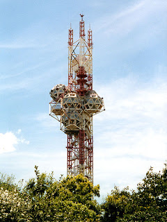
Expo Tower, Osaka 1970 by Kiyonori Kikutake (Constructed of a central steel pipe with geodesic sphere attachments allowing for further expansion and a panoramic view of the expo)
https://blogger.googleusercontent.com/img/b/R29vZ2xl/AVvXsEhpMbVbaG9q5dAf9FdGtkUcnJTlNhkl4Pf6R4YO_V3tGlYGKf9p5IWtZ0Qe7rSdIhVyKsKJlvKBKAPSQ9GtTcMEn9epI_b4fsRwvB-XsA1D5MMPQJTb88MPM5wZAMGuG2kWIoEV0ixOcBNX/s400/takara.jpg
Beautilion Takara, Osaka Expo in 1970 by Kisho Kurokawa (a structure of cube caps giving an incomplete aesthetic as a concept of constant growth)
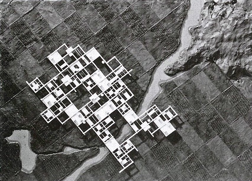
Marine City, 1958-1963 by Kiyonoiri Kikutake
Kikutake Kiyonori Eco Polis c. 1990/2011 (Collage) Courtesy: Kikutake Kiyonori Digital retouch: Hagiwara Kei.
Eco Polis by Kikutake Kiyonori, 1990 (Collage: Kikutake Kiyonori Digital retouch: Hagiwara Kei, 2011)
 ECO POLIS by Kikutake Kiyonori (unbuild) early 1990s (Illustration: Morinaga Yoh)
Agricultural City Project by Kurokawa Kisho(unbuild),1960 (Illustration: Morinaga Yoh)
Syowa Station by Asada Takashi and others in 1957. Antarctic  (Illustration: Morinaga Yoh)
Capsule Tower by Kisho Kurokawa (one of the most famous Metabolist residential and office building)


Nakagin Capsule Tower


Sunday, 9 December 2012

The Sin Centre


     The Sin Centre (1962) also known as the, “Entertainment Palace” was Michael Webb’s final student thesis that received a failing grade at the Regent Street Polytechnic even after receiving recognition from the MoMA as a technic icon and was later featured in Archigram 2. It was proposed for the site on Empire Theatre in Leicester Square, London. It was an attempt to bring together separate elements of show time audience and parked cars with inclined plates that form a winding ramp system. Michael Webb’s Sin Centre has been displayed at MoMA and has become a technic icon. The Entertainment Palace consists of a bowling alley, a cinema, theatre, coffee bars and dance areas. Furthermore, there is a large department store at the ground level and office space above. The spaces are designed to allow for easy circulating around the facility. Cross-over ramps allow easy movement for the cars and parking. Cables hold the entire structure together and the floors are hung by tension cables from heavy cantilever beams supported off the top of staircase towers.


An axonometric of Helical Stairway

Reclining Cushicle


Click the image and use arrow keys to view as flipbook.


Side elevation of the Cushicle chassis opening and envelope assembling


A Private Residence


            The man in the photos above is David Greene. David Greene is sporting a Suitaloon that was constructed for an exhibition in the international section of the Milan Triennale in 1967. The theme of this Milan Triennale was "The Greater Number" and dealt with the issues of a rapidly expanding 
world population.


    Above are maps of the Archigram pavilion at the Milan Triennale. These Handouts were featured in Archigram 8: Popular Park 

Archigram 8: Popular Pak


           “In seven years the discussion has shifted : first from a search for form to the throwaway building. From this to the notion of the all-happening city and from this, inevitably to the future of the ‘building’ as such. In Archigram Seven the notion of assemblies of programmed or designed objects was beginning to loosen-up so that it is no surprise to us that Archigram Eight is entirely concerned with the problem of direct personal provision : of comfort, facility, satisfaction, enquiry, and above all the effect of all kinds of phenomena upon each other.

– Peter Cook, Archigram 8 Editorial


    Achigram 8 was distributed as a set of cards. These cards were packaged in a yellow envelope. The futuristic text of earlier issues was dropped and replaced with an Art Nouveau style of font. Archigram 8 revolved around eight terms: metamorphosis, nomad, indeterminacy, hard/soft, emancipation, exchange, response and comfort. Archigram 8 came with a legend that classified what terms each project emphasized. Metamorphosis, nomad, indeterminacy and comfort were the terms highlighted next to Mike Webb’s Cushicle. Both the Cushicle and Suitaloon are featured as separate projects in Archigram 8: Popular Pak. The Cushicle and Suitaloon are not viewed as a single project in any issue of Archigram.


A diagram of two Suitaloons combining into one can be found under the heading “Comfort for Two”. This was the first appearance of the Suitaloon in Archigram. The Suitaloon is found in Archigram 8 near an article entitled ‘Hard and Soft-ware’. This article and the Suitaloon had the same goal in mind. They both set out to blur the line between mechanical and biological systems. The Suitaloon was a biological organism and its mechanical enclosure interacting as one with other systems like the Cushicle. The basic necessities found in the Cushicle and Suitaloon are stripped down to a systems of pipes that wrap around the body to heat and protect it, like some form of mechanical exoskeleton.


            “These terms ‘hardware’ and ‘software’ are taken from computer jargon. ‘Hardware’ refers to any tangiable (sic), touchable object. ‘Software’ is the system, message or programme that can be transmitted but not touched.In systems planning we are reaching a point where the statement ‘the software’ is sufficient to organise the right (control of/positioning of) arrangement aof (sic) an environment. This oversimplification has the air – and necessity – of rhetoric at a particular moment in history. It is in fact very parallel to Futurist of Machine – architecture rhetoric. Hardware has limitations. Software is being pitched against it in order to expose architect’s continued complete hang up on hardware. One the thing has cooler off i litle (sic) we can get on with linking the two together as response systems.”

                                                                       -Hard and Soft-ware

 “When Otto drew a detail of the pneumatic spacesuit, he included human skin as a layer of the outfit. Sure enough, an Archigram project included in Archigram 8 wrapped a combination of a ‘soft’, inflatable form with responsive technology architecture around the body. The notion of the suit as the most basic form of housing was at the heart of Mike Webb’s design for the Suitaloon: Comfort for Two (1967).”

– Hadas A. Steiner


The Suitaloon as depicted in Archigram 8 represents this idea of the home becoming a second skin. It was a project with no definition of inside space and outside space, there was no divide between home and clothing. The Suitaloon was the ultimate in nomadic living, one of the central themes to Archigram 8. “With the possibilities of lightweight materials, Webb proposed an enclosure that was fully transportable, exploited the speed of expansion and deflation, constituted and reconstituted itself at will, like a lung. It was a house that was only as durable as clothing and as natural as a second skin.” The Suitaloon was not to be viewed as a machine for living, but rather as an ever adapting biological/mechanical extension of daily life.